Offer more than one way in.
Prominent search and category navigation support a known product. Product photography and occasion-led content support people still deciding what to make.

Lidl Fotos
My UX/UI redesign connects inspiration, product discovery, and configuration across desktop and mobile. A working prototype and reusable design system form the handoff reference—not a live shop.
Lidl Fotos serves people turning personal photos into books, wall art and gifts. My aim was to make discovery and product choices easier to follow without losing the brand’s accessible, value-conscious character.
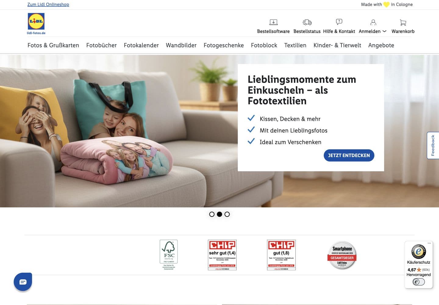
Structure comparison, not a controlled test. Campaigns differ; existing site reviewed October 2026.
Prominent search and category navigation support a known product. Product photography and occasion-led content support people still deciding what to make.
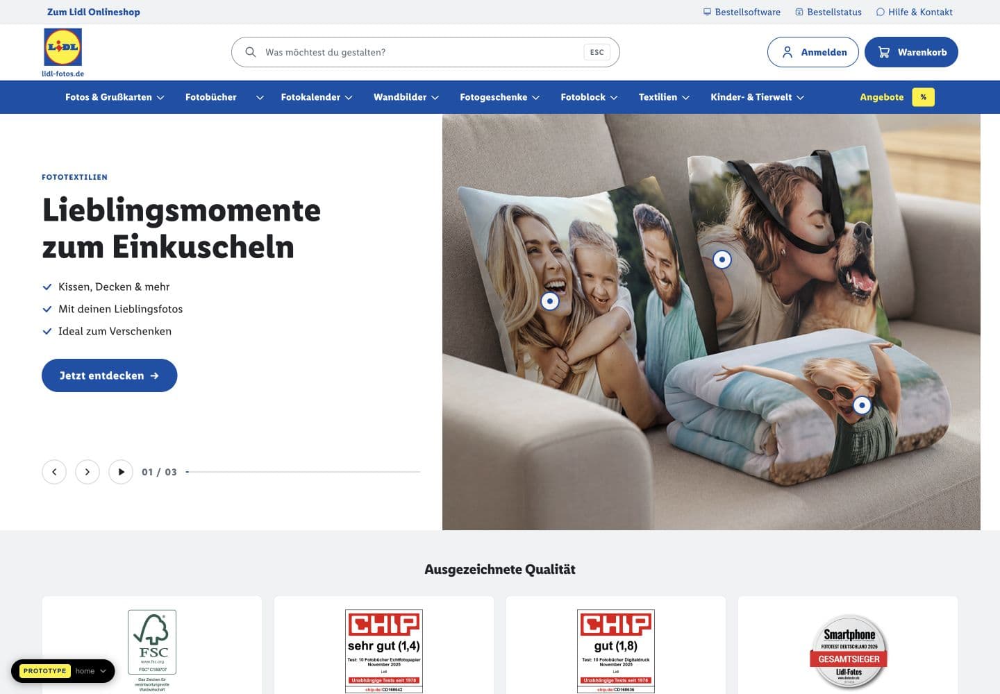
A split hero separates campaign copy from photography. A single primary action leads each message, while product hotspots connect inspiration to a specific item.
Category cards, pricing, selectors and buttons use a shared visual language across browsing and product-detail screens.
The homepage connects product discovery, a photo-upload entry point and occasion-led ideas. On mobile, the navigation becomes a compact header with category shortcuts, while photography leads the story.
Local prototype capture · Static screen preview, not a functioning shop. Prices, offers and service claims shown are demonstration content.
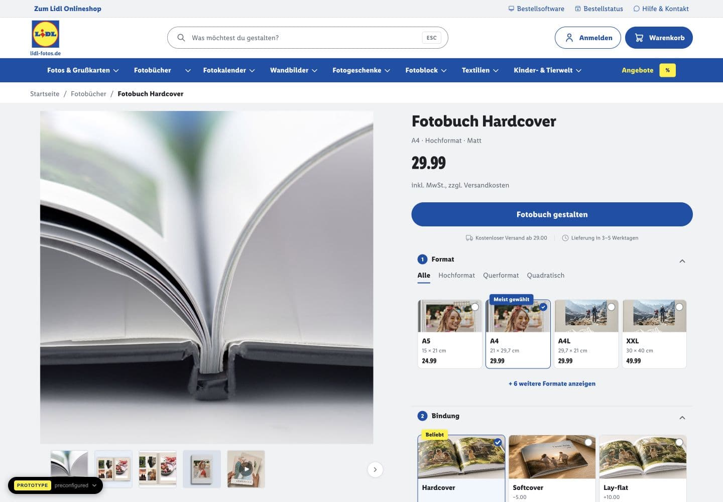
The photobook product view brings format and binding choices alongside the preview and price. Numbered groups, selected states and a concise product summary give each decision a place.
Product data and commerce services are mocked; the prototype is not connected to a live checkout.
The system turns visual direction into reusable rules: semantic colors, a type scale, spacing, controls and their states. Blue gives structure; yellow is a small emphasis; red marks promotional moments.
Explore the supplied reference’s color roles, type scale, controls and interaction states.
Loads on request · Portable demo uses fallback fontsTokens connect color, spacing and typography to how the interface is used. Shared values make changes easier to carry across screens.
The demo exposes hover, pressed, focus and disabled states, alongside input and feedback patterns, for review before implementation.
The prototype demonstrates responsive behavior. Supporting documentation distinguishes design decisions from the production services still to be connected.
The deliverables are a responsive prototype, a design-system demo, and handoff documentation. Usability and conversion benefits remain hypotheses; launch and performance results are not established.
Can people find a product, understand format and price, and start personalization without backtracking? I would test task success, mobile and keyboard usability, and product-to-editor progression after integration.
Prototype prices, offers, and testimonials are demonstration content, not commercial facts or research evidence.
Next case studyRossmann Fotowelt