Retail clarity
Product, price, and the next action stay easy to scan across dense commerce moments.

My 2026 visual direction and UI system for Rossmann Fotowelt bring retail clarity and personal warmth to desktop and mobile. The second design iteration is approved; implementation is in progress.
Photo products carry two kinds of meaning at once: they are practical purchases and personal objects. The direction uses disciplined commerce structure for confidence, then brings warmth through imagery, spacing, and softer supporting surfaces.
Product, price, and the next action stay easy to scan across dense commerce moments.
Family imagery and warm neutral surfaces keep the experience connected to personal memories.
The same hierarchy and interaction vocabulary carry from wide product pages into focused mobile flows.

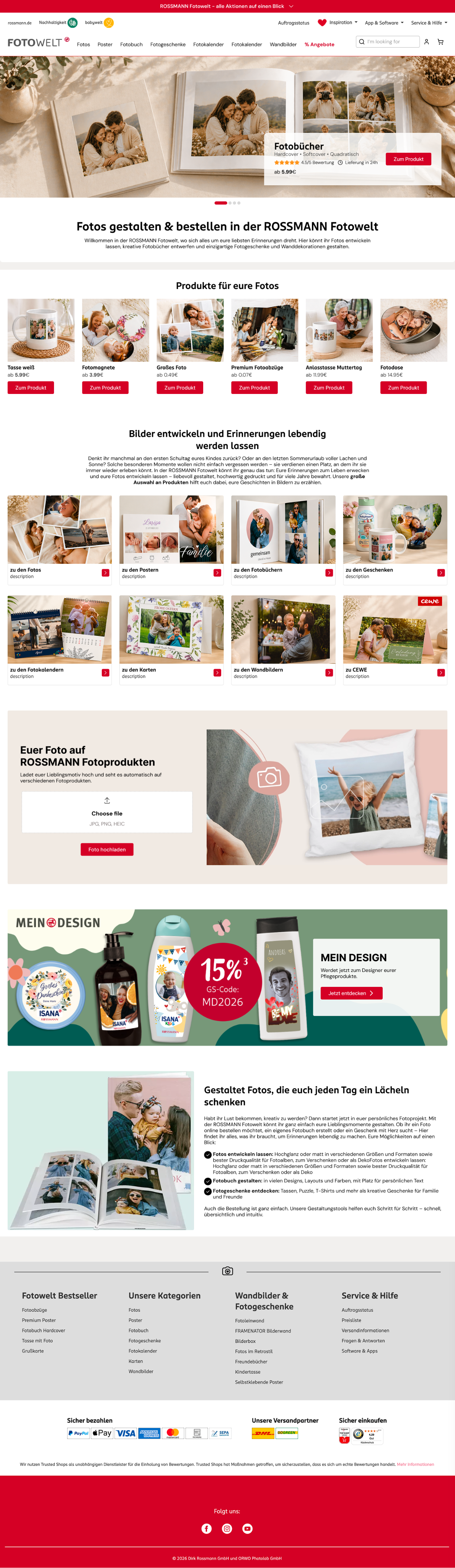
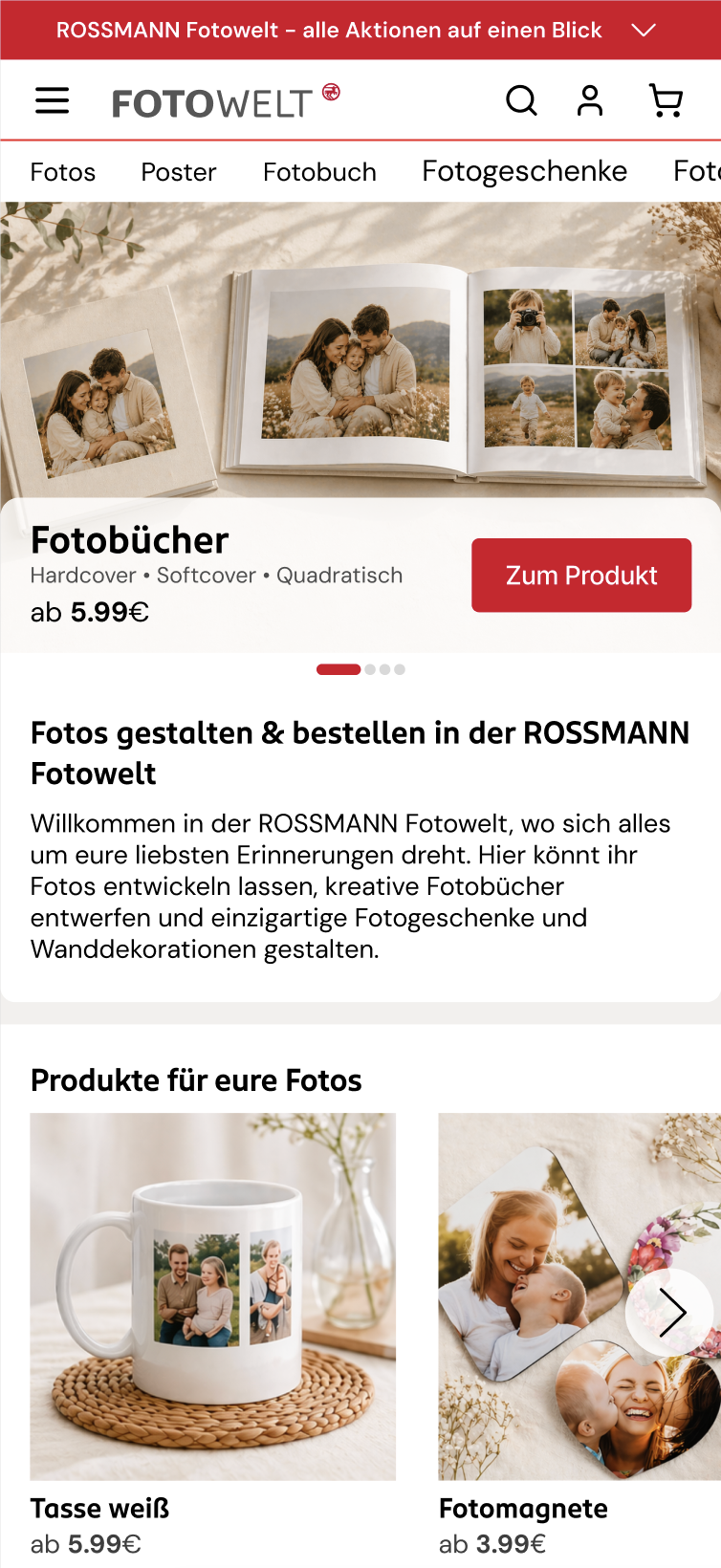
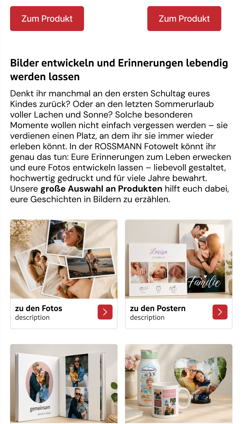
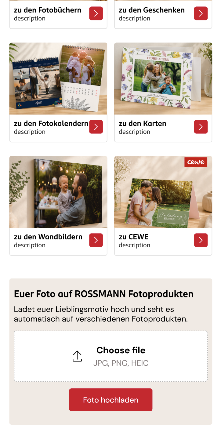
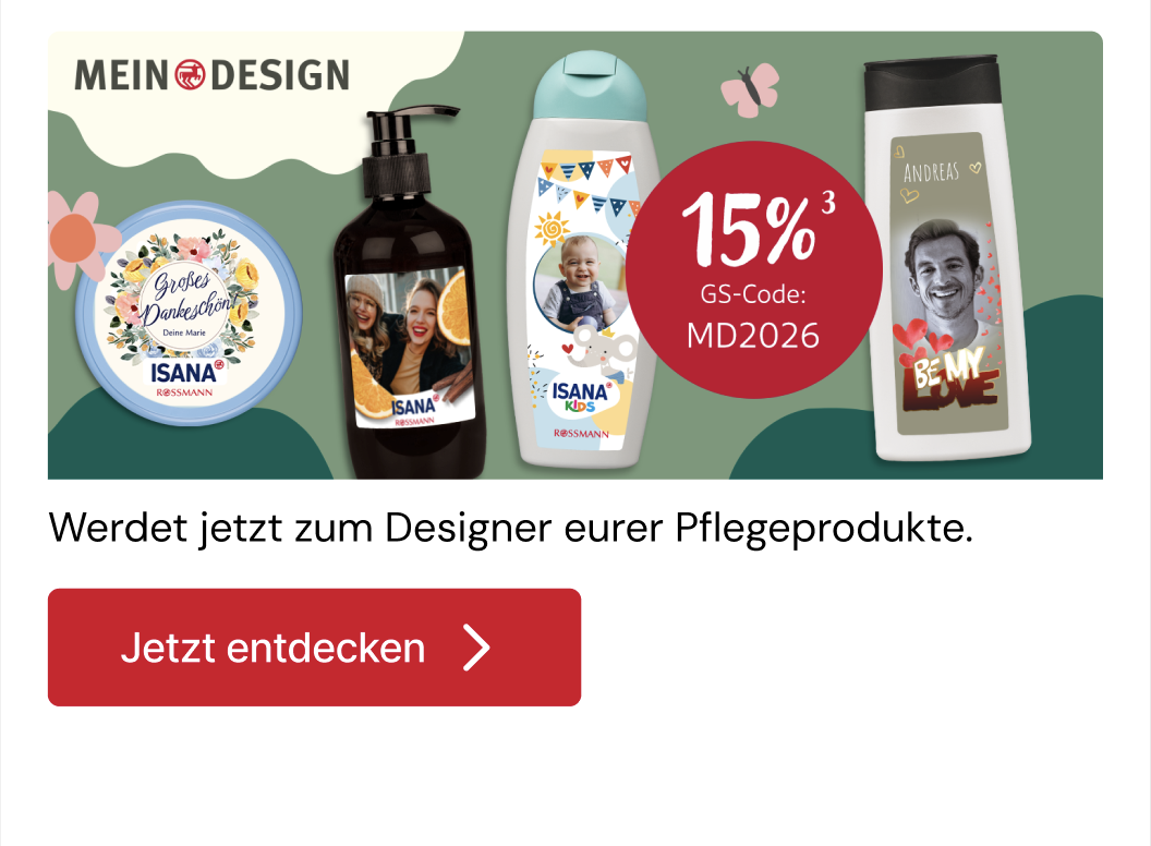
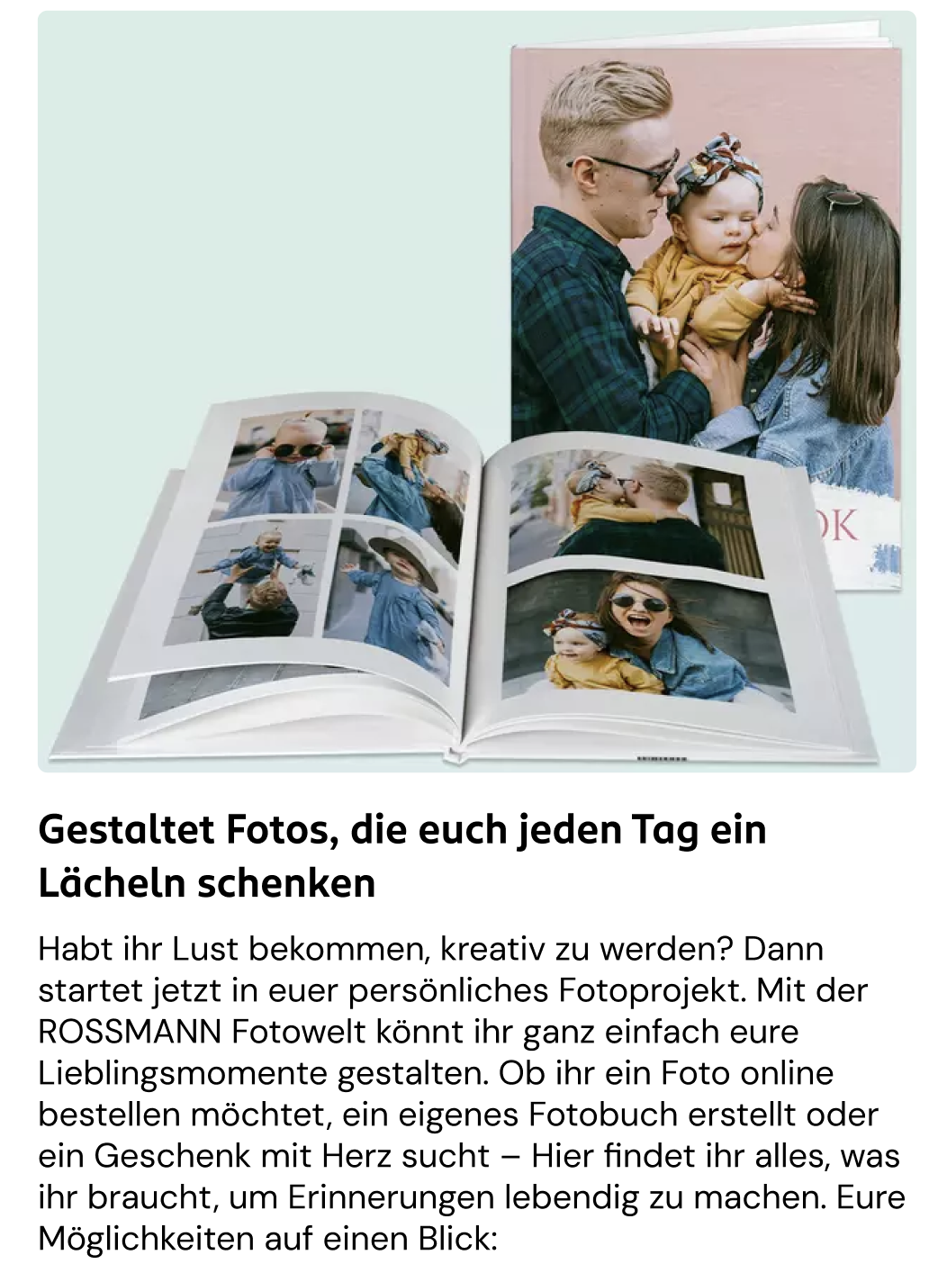
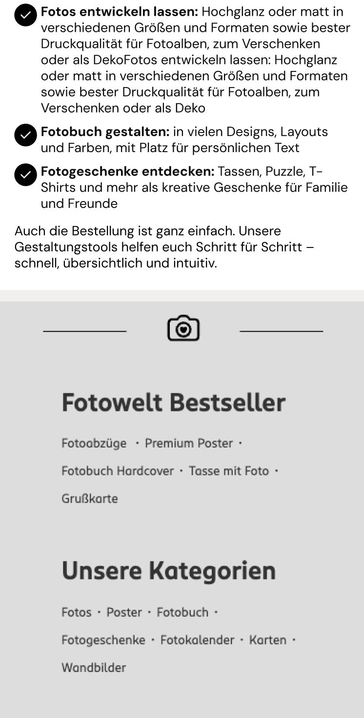
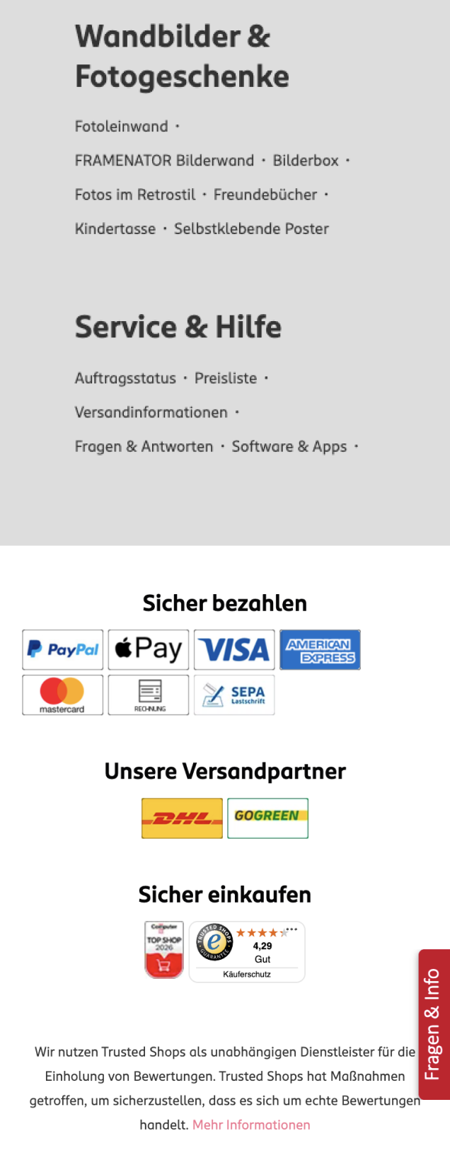

Approved iteration 2 · Responsive homepage redesign
Rossmann red leads important moments while cream, blush, and off-white create room for product and photography.
Buttons, filters, cards, controls, and promotional modules share the same geometry and hierarchy.
Desktop gives comparison room; mobile protects focus. Both keep the same priorities visible.
Warm, candid scenes connect the interface to the memories customers are trying to preserve.
The second design iteration is approved. Implementation is in progress; production and performance results are not yet available.
Next case studySendmoments Configurator